 Sumit Yadav
We live in a pocket-sized world. For years, the desktop computer reigned supreme as the primary gateway to the internet. Today, that narrative has fundamentally changed. A staggering majority of global web traffic originates from mobile devices, and this shift is more than just a preference—it’s a powerful directive from the search giant, Google.
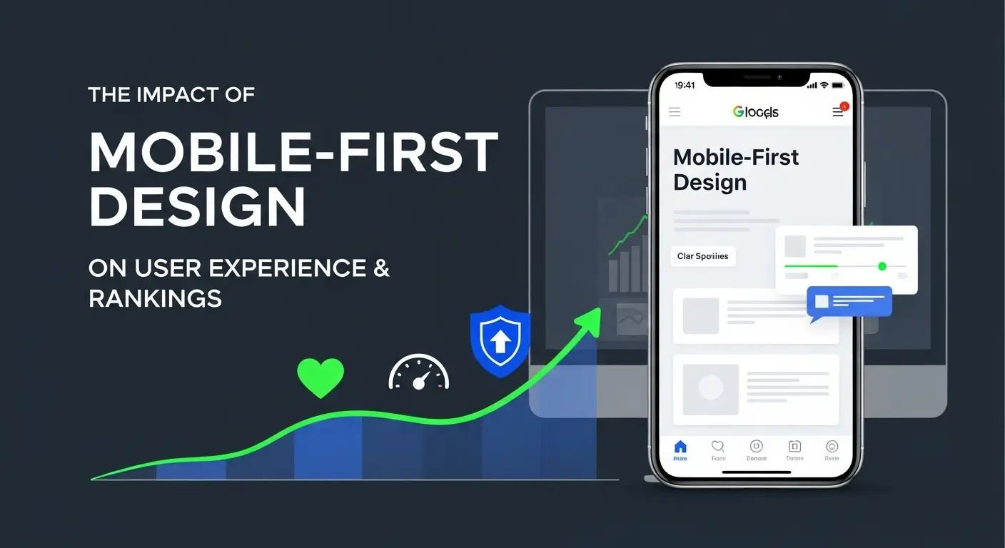
Mobile-First Design (MFD) is no longer an optional best practice; it is the foundational requirement for digital longevity and success. It signifies a strategic approach where the design and development of a website begin with the smallest screens (smartphones and tablets) before scaling up to larger desktop monitors. This methodology forces a focus on critical elements: speed, clarity, essential content, and usability. Achieving excellence in this field often necessitates specialized expertise, especially when looking for comprehensive web development services in Noida or other major tech hubs.
This comprehensive guide will explore the profound and intertwined impact of Mobile-First Design on User Experience (UX) and critically, the resulting SEO rankings. We will uncover how optimizing for the smallest screen has become the single most important factor determining your visibility in competitive search results.
The Dawn of Mobile-First Indexing: A Google Mandate
To truly understand the crucial nature of MFD, one must first grasp the concept of Mobile-First Indexing.
Before 2018, Google’s bots primarily used the desktop version of a website to assess content, quality, and relevance, even if most users were on mobile. If your mobile site was simplified or lacked key content compared to the desktop version, you were indexed based on the richer desktop content.
Mobile-First Indexing flipped this dynamic entirely. Since 2018, Google predominantly uses the mobile version of your content for indexing and ranking determination. This means:
- If your mobile site is slow, your ranking suffers.
- If your mobile site hides important information, that content won’t be indexed.
- If your mobile site is difficult to navigate, your ranking potential is severely limited.
This monumental policy shift cements MFD as the baseline standard for effective search engine optimization. Ignoring mobile optimization is synonymous with offering the search engine a subpar version of your product—and expecting premium results.
The Direct Impact on SEO Rankings
The benefits of MFD are quantifiable through key performance indicators (KPIs) that Google uses to filter and rank billions of pages. Successful implementation of MFD directly translates into improved algorithmic assessment, boosting your site’s authority and visibility.
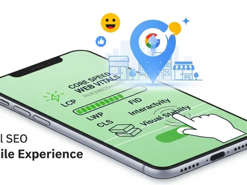
1. The Core Web Vitals Imperative
Perhaps the most significant measurable outcome tied to MFD is performance against Core Web Vitals (CWV). CWV are a set of metrics focused on real-world user experience and are foundational ranking factors, especially on mobile devices.
A well-executed mobile-first strategy naturally prioritizes these metrics:
- Largest Contentful Paint (LCP): Measures loading performance. MFD necessitates faster image optimization and minimal resource blocking, ensuring the main content loads quickly on slower mobile connections.
- First Input Delay (FID): Measures interactivity. MFD focuses on lean code and efficient scripting, reducing the time it takes for a user to interact with the page (e.g., clicking a button).
- Cumulative Layout Shift (CLS): Measures visual stability. A poorly designed mobile site often suffers from content jumping as elements load, creating a frustrating experience. MFD ensures elements are properly sized and placed, providing a smooth, stable experience.
By addressing the constraints of mobile environments first, you inherently improve speed and stability, thereby improving your CWV scores and, consequently, your Google ranking factors.
2. Ensuring Content Parity and Indexability
A common mistake made by sites built desktop-first is the deliberate exclusion or trimming of content on the mobile version to “save space.” Under Mobile-First Indexing, this content is effectively invisible to Google.
MFD dictates content parity—the mobile site must contain the same high-quality, relevant content, structured data, internal links, and metadata as the desktop version. Responsive web design allows the content to adapt, not disappear. If you want a specific keyword to rank, it must be present and visible on the mobile version that Google uses to crawl and index your page.
3. Mobile Usability and Accessibility as Ranking Signals
Google uses automated checks to evaluate mobile usability, which forms a critical component of its ranking calculation. If users cannot easily interact with your site on their phones, Google views the page as low quality.
Key usability factors prioritized by MFD include:
- Finger-Friendly Tap Targets: Buttons and links must be large enough and spaced far enough apart to be accurately pressed by a finger, preventing misclicks and frustration.
- Legible Font Sizes: Text must be readable without requiring the user to pinch and zoom.
- Avoidance of Intrusive Interstitials: Pop-ups and overlays that block content on mobile devices are penalized, as they severely degrade the experience. MFD requires subtle, non-blocking calls-to-action.
Elevating User Experience (UX) Through Mobile-First Design
While technical SEO factors drive ranking potential, it is User Experience (UX) that determines whether a visitor stays, converts, or bounces. UX and SEO are intrinsically linked; a good UX leads to lower bounce rates and higher dwell time, which signals site quality to Google.
1. Intuitive Navigation and Information Hierarchy
Designing for a small screen forces clarity and rigor in site architecture. With limited real estate, you must prioritize information. MFD often utilizes clean, consolidated menu structures (like the hamburger menu) and clear hierarchical breadcrumbs. Understanding the intricate role of UI/UX design in web development is essential here, as it determines how efficiently a user can find critical information and navigate the site’s content structure.
The MFD approach ensures:
- Essential Information First: The most critical CTAs and value propositions are above the fold, immediately accessible.
- Streamlined Processes: Checkout forms, contact fields, and sign-up processes are simplified, using larger input fields and leveraging mobile features like auto-fill and number keyboards.
- Reduced Cognitive Load: Users aren’t overwhelmed by too many choices or cluttered visuals, making the journey to conversion faster and easier.
2. Lowering Bounce Rates and Boosting Dwell Time
A slow-loading or difficult-to-use mobile site results in immediate abandonment—a high bounce rate. MFD, with its emphasis on speed and usability, directly combats this.
When a site loads rapidly (improving LCP) and offers an intuitive experience, users are more likely to stay, consume content (increasing dwell time), and explore other pages (improving pages per session). These positive signals reinforce to Google that your page is a highly effective resource for the user’s query, solidifying your SEO rankings.
3. Conversion Rate Optimization (CRO) on Mobile
The ultimate goal for most businesses is conversion, whether that’s a purchase, a lead generation form fill, or a newsletter sign-up. Studies repeatedly show that poor mobile experiences drastically reduce conversion rates.
MFD directly improves conversion rate optimization (CRO) by:
- Streamlining Checkout: Limiting steps and complexity in the purchasing funnel.
- Optimizing Imagery: Ensuring product photos are high-quality but compressed, providing zoom functionality without sacrificing page speed.
- Contextual CTAs: Placing calls-to-action where they are most relevant and easily reachable (often near the bottom of the screen or along the thumb path).
Implementing a Winning Mobile-First Strategy
Transitioning or developing a site with a true mobile-first ethos requires more than just making a site “responsive.” It demands a strategic shift in planning and execution.
Key Actionable Steps for Mobile-First Success:
| Strategic Area | Mobile-First Implementation | SEO Benefit |
| Performance | Audit all third-party scripts; aggressively compress all images using next-gen formats (WebP). | Improves Core Web Vitals (LCP, FID). |
| Content | Ensurealltext, structured data, and internal links present on desktop are also present on the mobile view. | Guarantees content parity and indexability. |
| UX/Design | Use large, clear, contrasting fonts. Design navigation for the thumb. Optimize form inputs for mobile keyboards. | Reduces bounce rate; improves mobile usability signals. |
| Technical | Implement responsive design (CSS media queries) rather than separate mobile domains (m.dot sites). | Simplifies crawling, indexing, and link equity consolidation. |
| Testing | Regularly test site speed and usability using Google’s Mobile-Friendly Test and PageSpeed Insights. | Proactive identification of ranking roadblocks. |
The Myth of the Separate Mobile Site
It is critical to note that the industry standard for Mobile-First Design is Responsive Web Design (RWD). RWD uses a single URL and codebase that adapts the layout based on the user’s screen size. Using separate mobile domains (like m.yoursite.com) is highly discouraged today, as it complicates content synchronization, SEO maintenance, and cannibalizes link equity. A unified RWD strategy is the leanest and most effective way to address Mobile-First Indexing.
Conclusion
The shift to Mobile-First Design is a permanent marker in the timeline of digital marketing. It is the clearest signal yet that Google prioritizes the real-world experience of the user above all else.
For businesses looking to secure high SEO rankings and deliver exceptional User Experience, designing with a mobile-first mindset is non-negotiable. By prioritizing speed, usability, and consistent content delivery on the smallest screen, you satisfy Google’s indexing requirements while simultaneously catering to the majority of your audience. Embracing this strategy is not merely catching up with current trends; it is strategically positioning your business for sustained growth and visibility in the competitive digital landscape of tomorrow. Businesses operating in competitive local markets often seek external support to maintain these high standards, making specialized SEO Services in Noida invaluable for those aiming to dominate local and national search results.